Monday 2 December 2013


Friday 3 May 2013
Music Video - Roles
Director: Jess
Camera: Phoebe
Sound: Dani
The Band: Christy, Pask, Kane
Teacher: Meg
2 girls that walk past: Holly, Hannah
Turnaround Girl: Kelly
Camera: Phoebe
Sound: Dani
The Band: Christy, Pask, Kane
Teacher: Meg
2 girls that walk past: Holly, Hannah
Turnaround Girl: Kelly
Wednesday 1 May 2013
Final Post
To the examiner:
I hope you enjoy reading my blog, all of my posts have been labelled and can be viewed on the right hand side. I have really enjoyed doing this coursework, and have put a lot of effort in to create the final magazine.
Thank you!
I hope you enjoy reading my blog, all of my posts have been labelled and can be viewed on the right hand side. I have really enjoyed doing this coursework, and have put a lot of effort in to create the final magazine.
Thank you!
Monday 22 April 2013
Final Evaluation Question 6
What have you learnt about technologies from the process of constructing this product?
Cameras:
To take my images I used a standard SLR camera, which was a ‘Panasonic Lumix DMC-FZ28’. Although this wasn’t extensively extensive and a specialised camera, it is my own so I am comfortable with all of the settings and certain techniques used to create high standard pictures. I used this camera to take pictures of the models on the front cover, contents page and the double age spread. However if I were to change things next time I would use a more credible and reliable camera that produces high quality, and magazine potential images. I changed the cameras aperture in order to make the depth of field a lot smaller. This way the main attention was focused on the face, rather than the background. I learnt that by increasing the shutter speed the picture became a lot sharper.

Computers:I mainly used the school computers as they are installed with all of the editing software needed to create a successful magazine. The computers were reliable and were equipped with all of the platforms of media I needed. With the speediness of the computers my time was spared efficiently and rarely needed to do extra work at home. Although I have a PC at home with Photoshop installed, I found that my laptop was working overtime and after a while became slow and unreliable with saving important documents and files.

Lighting:I used two soft light boxes to make the quality of my photos better, but to also eliminate any traces of shadows that can occur when using flash photography, etc. This allowed me to follow Terry Richardson’s steps in creating bright images which makes the complexions on the models faces flawless and airbrushed.

Flickr:
I used flickr to download most of my camera roll and present them in a professional way. This way I could see all of the test shots and final shots and compare them in quality and potential. My peers could see this on my blog and I got feedback from teachers as to how I can improve them in the final shots.
Animoto:I used animoto at the start of my research and planning. I created a 25 word pitch which included some of the ideas and themes that I would like to occur within the magazine. Animoto allowed me to present it in a professional and quirky way, portraying the personality and features of the magazines future content and graphology.

Blogger:Blogger was probably one of the most used technology during the process of the making of my magazine. I updated the blog whenever I had inspiration and ideas. I also included presentations, images and pictures that I had taken along with some feedback from fellow peers and teachers. By keeping a track of my process I could refer back to any stages in the research to finalise any more inspiration from the research and planning stages. It helped having the dates of posts as I could then plan the timings and ensure that I meet the deadline without hesitation.

Microsoft Word:I used this word processing software to spell check all of my work and to write up my double page spread to see the word count so I could plan the positioning of the double page spread.

Internet Explorer:The internet was essential to me within the research and planning stages as wanted to research other magazines in order to inspire me to take in all of the conventions of the magazines and portray them within my magazine. I also looked at certain artists and bands websites so I could look at how that particular person has been represented towards the genre of their music. Some of the websites that I went on were; http://lookbook.nu/ . This website gave me many ideas and inspirations on ways I could have dressed the models featured in the magazine. Some of the poses featured on ‘lookbook’, gave me an insight on how I could improve the way my artists were presented, leaving a quirky and edgy vibe towards the magazine. Other websites were; www.loudandquiet.com and www.i-donline.com. I used the internet to download my font ‘Blackout Midnight’ on www.fontsquirrel.com/fonts/Blackout.

PaintI used paint many times to transfer certain images and to edit them which was a quick and efficient process. Although these steps could have been done on Photoshop, I felt that I was more specialised on a simple design pack such as paint. I edited the ‘DIVISION’ logo and title on here. The tools were simple and easy to follow; it was an extremely reliable form of media.

Adobe Photoshop CS6 ExtendedPhotoshop was the editing software I used throughout the making of my preliminary magazine and my final magazine. I used this on the school computers as they ran really quickly and efficiently allowing me to get my work done quicker. On Photoshop I learnt how to cut around objects or people (models) in an accurate way by using the magnetic lasso tool, it left a really neat edge around the object/person. I also edited some of the photographs on here, such as airbrushing the models slightly (I didn’t need to do much airbrushing as the lighting helped eliminate any redness or blemishes that the model had).


Thursday 18 April 2013
Wednesday 17 April 2013
Tuesday 16 April 2013
Friday 22 March 2013
6.
What have you
learnt about technologies from the process of constructing this product?
Cameras:
In order to achieve high quality pictures I used a standard SLR camera; which is a Panasonic Lumix DMC-FZ28. Although this wasn’t a really expensive SLR camera to use, it was easy to use as it was my own camera, therefore I knew how all of the settings worked.
Cameras:
In order to achieve high quality pictures I used a standard SLR camera; which is a Panasonic Lumix DMC-FZ28. Although this wasn’t a really expensive SLR camera to use, it was easy to use as it was my own camera, therefore I knew how all of the settings worked.
Computers:
I mainly used the school computers as they are installed with all of the editing software needed to create a successful magazine. They run much faster on my laptop at home, however I do have Photoshop at home, which allowed me to work more at home than at school.
I mainly used the school computers as they are installed with all of the editing software needed to create a successful magazine. They run much faster on my laptop at home, however I do have Photoshop at home, which allowed me to work more at home than at school.
Lighting:
I used two light boxes to make the quality of my photos better, but to also eliminate any traces of shadows that can occur when using flash photography, etc.
I used two light boxes to make the quality of my photos better, but to also eliminate any traces of shadows that can occur when using flash photography, etc.
Flickr:
I used flickr to download most of my camera roll and present them in a professional way. This way I could see all of the test shots and final shots and compare them in quality and potential.
I used flickr to download most of my camera roll and present them in a professional way. This way I could see all of the test shots and final shots and compare them in quality and potential.
Animoto:
I used animoto at the start of my research and planning. I created a 25 word pitch which included some of the ideas and themes that I would like to occur within the magazine.
I used animoto at the start of my research and planning. I created a 25 word pitch which included some of the ideas and themes that I would like to occur within the magazine.
Blogger:
Blogger was probably one of the most used technology during the process of the making of my magazine. This was because I updated the blog whenever I had inspiration and ideas. I also included presentations, images and pictures that I had taken along with some feedback from fellow peers and teachers.
Blogger was probably one of the most used technology during the process of the making of my magazine. This was because I updated the blog whenever I had inspiration and ideas. I also included presentations, images and pictures that I had taken along with some feedback from fellow peers and teachers.
5.
How did you attract/address your audience?
In order to attract my audience I had to consider the age range for my magazine. The age range is 16-27 year olds. My magazine has potential to be a non-gender specific magazine. However with a girl on the front cover the magazine only attracts the female gender. The main part of the magazine cover is the bold masthead. It is the first thing that is seen as it is at the very top of the magazine which sells the magazine, but also is seen clearly on shelves. By having the font reasonably large, black and bold, against the neutral background it is very prominent. In some other ways the model can also attract my audience, as I dressed my model in a similar style to the audience’s style and the genre of the magazine. I made sure that the model was facing directly into the camera, as if they were enticing the readers to buy the magazine. By having my artists name on the front cover it allows the audience to indentify her and they will know that this issue will feature some sort of interview starring ‘Rosa Leigh’. In the double page spread I thought it was important to include some pull quotes that were rather gossip-like, making the interview seem very personal to the reader.
In order to attract my audience I had to consider the age range for my magazine. The age range is 16-27 year olds. My magazine has potential to be a non-gender specific magazine. However with a girl on the front cover the magazine only attracts the female gender. The main part of the magazine cover is the bold masthead. It is the first thing that is seen as it is at the very top of the magazine which sells the magazine, but also is seen clearly on shelves. By having the font reasonably large, black and bold, against the neutral background it is very prominent. In some other ways the model can also attract my audience, as I dressed my model in a similar style to the audience’s style and the genre of the magazine. I made sure that the model was facing directly into the camera, as if they were enticing the readers to buy the magazine. By having my artists name on the front cover it allows the audience to indentify her and they will know that this issue will feature some sort of interview starring ‘Rosa Leigh’. In the double page spread I thought it was important to include some pull quotes that were rather gossip-like, making the interview seem very personal to the reader.
4.
Who would be the audience for your media product?
The audience for my magazine will be people aged 16-27. Although it isn’t a wide audience range, most of the readers and audience are aged between 18-20. The audience will also be people who are attracted to the indie nature and genre that the magazine provides. The readers could be interested in these particular artists and bands; The XX, The Maccabees. These feature on the front cover and my contents page. There are some sections where fashion is involved, which could appeal to some of the female viewers. However if it were to be a unisex magazine, I will need it to appeal to males as well as females. Here I would include long shots of models wearing ‘indie’ classed clothing, which can reflect back on the genre of my magazine. People are attracted to this magazine as it is simplistic, modern, intuitive and professional looking. The model on the cover could definitely sell and entice the readers, as the readers want to be constantly updated with the music industry and not miss out on any new potential artists or bands.
The audience for my magazine will be people aged 16-27. Although it isn’t a wide audience range, most of the readers and audience are aged between 18-20. The audience will also be people who are attracted to the indie nature and genre that the magazine provides. The readers could be interested in these particular artists and bands; The XX, The Maccabees. These feature on the front cover and my contents page. There are some sections where fashion is involved, which could appeal to some of the female viewers. However if it were to be a unisex magazine, I will need it to appeal to males as well as females. Here I would include long shots of models wearing ‘indie’ classed clothing, which can reflect back on the genre of my magazine. People are attracted to this magazine as it is simplistic, modern, intuitive and professional looking. The model on the cover could definitely sell and entice the readers, as the readers want to be constantly updated with the music industry and not miss out on any new potential artists or bands.

3.
What kind of media institution might distribute
your media product and why?
Within my research and planning I originally thought that ‘Bauer’ media institution would be the best institution for my magazine. However, after taking some vigorous research into my magazine I feel that ‘IPC Media’ is now the best opportunity for my magazine. The reason why I have decided to go ahead with IPC Media is that it has many different popular names of magazines underneath their name. It would make my magazine ‘look good’ publicity wise. With such a vast amount of audience types that IPC attracts, such as NME. Some of the more gossip and chatty magazines such as ‘Pick me up’ are associated with this media institution, which could be a slight negative point and a downfall in some readers. There will be many platforms in which my magazine could be sold from. There will be a website for my magazine with the option to subscribe to the magazine, with a special subscribers edition of the magazine, which will not feature any taglines on the front cover. I will also have the magazine accessible via apps.
Within my research and planning I originally thought that ‘Bauer’ media institution would be the best institution for my magazine. However, after taking some vigorous research into my magazine I feel that ‘IPC Media’ is now the best opportunity for my magazine. The reason why I have decided to go ahead with IPC Media is that it has many different popular names of magazines underneath their name. It would make my magazine ‘look good’ publicity wise. With such a vast amount of audience types that IPC attracts, such as NME. Some of the more gossip and chatty magazines such as ‘Pick me up’ are associated with this media institution, which could be a slight negative point and a downfall in some readers. There will be many platforms in which my magazine could be sold from. There will be a website for my magazine with the option to subscribe to the magazine, with a special subscribers edition of the magazine, which will not feature any taglines on the front cover. I will also have the magazine accessible via apps.
2.
How does your media product represent particular
social groups?
As I have said previously, the way my artist dresses will attract a
particular social group. My artist is represented in a unique way, which is
rather simple and shouts minimalism. The delicateness of her facial features
could attract both males and females to read the article about her. She looks
very normal looking and so can attract females, as they are of a similar age to
her, and could almost relate to the artist, which could entice them to read
and/or buy the magazine. Styles and trends are consistently changing, so by
having the professional clean and edgy appeal to the magazine it is attracting
those who are passionate about indie and alternative music, with a creative
streak to them. Although the colour palette may not necessarily be eye
catching, the intuitive approach to the magazine will gather a wide
audience. The way I took the image is in
the similar style of Loud & Quiet magazine.

The graphology is very similar to this example of
magazine, with a very similar colour palette. However the images on loud and
quiet are very quirky. This image here definitely has an ‘indie’ feel to it.
Although this is last year’s edition, the style of the model is classy and
seems as though it will never date as of yet.
Another pointer is the typography and the discourse
structure. The way the lettering and graphology is positioned, it is all
aligned with one another. This makes the cover more aesthetically pleasing,
again, enticing the readers to buy or read the magazine.
1.
In what ways does your media product use,
develop or challenge forms and conventions of real media products? (i.e. of
music magazines)
Magazine
Title
The masthead of my magazine is called ‘DIVISION’. The font that I used was ‘Blackout Midnight’ which I found on www.fontsquirrel.com/fonts/Blackout. I decided to use this font as it is very similar to the magazine currently on the market, such as ‘INDIE’, and ‘Loud & Quiet’. Both magazines have bold typography with a prominent masthead. However by having some of the letters coloured in black, it makes the magazine more memorable to the public eye. I thought black would be a safe option and works well on all types of backgrounds that may occur within the magazines future. I chose ‘DIVISION’ to be the title of my magazine as it could relate to the division in the music industry between each genre.
The masthead of my magazine is called ‘DIVISION’. The font that I used was ‘Blackout Midnight’ which I found on www.fontsquirrel.com/fonts/Blackout. I decided to use this font as it is very similar to the magazine currently on the market, such as ‘INDIE’, and ‘Loud & Quiet’. Both magazines have bold typography with a prominent masthead. However by having some of the letters coloured in black, it makes the magazine more memorable to the public eye. I thought black would be a safe option and works well on all types of backgrounds that may occur within the magazines future. I chose ‘DIVISION’ to be the title of my magazine as it could relate to the division in the music industry between each genre.
Graphology
and Page Layout
I wanted the page layout to reflect a minimalistic, modern, fresh and clean approach, alongside the graphology. By keeping a neutral colour palette with no bright, contrasted hues, the magazine looks professional and links in with some of the magazines that I was inspired by, such as ‘Dazed and Confused’, and ‘Loud & Quiet’. Loud & Quiet really influenced my front cover page, by having the border around the image and taglines. The main attention of the magazine cover, is the image, (Rosa Leigh’s hair brings in another colour to the palette) and the masthead. By having each tagline and layer that is made on Photoshop, I made sure each layer aligns up with one another so that it looks correct towards the eye.
I wanted the page layout to reflect a minimalistic, modern, fresh and clean approach, alongside the graphology. By keeping a neutral colour palette with no bright, contrasted hues, the magazine looks professional and links in with some of the magazines that I was inspired by, such as ‘Dazed and Confused’, and ‘Loud & Quiet’. Loud & Quiet really influenced my front cover page, by having the border around the image and taglines. The main attention of the magazine cover, is the image, (Rosa Leigh’s hair brings in another colour to the palette) and the masthead. By having each tagline and layer that is made on Photoshop, I made sure each layer aligns up with one another so that it looks correct towards the eye.
Costumes,
Props and iconography – To reflect genre
To go alongside the graphology and page layout, I wanted to make sure my models were wearing suitable clothing to reflect my genre; ‘Indie’. I had to dress them in ‘current’ clothing. I used white collars, gold chains, and grey marled sweaters. Although this could have a R&B feel, I felt that these types of clothing related well to the genre, and can imagine my readers to wear these clothes to. The poses I directed to my models were very simplistic. However one pose is quite iconic in the sense that the eyes are not looking directly at the camera. I felt that it needed some more depth and for each picture to look unique.
To go alongside the graphology and page layout, I wanted to make sure my models were wearing suitable clothing to reflect my genre; ‘Indie’. I had to dress them in ‘current’ clothing. I used white collars, gold chains, and grey marled sweaters. Although this could have a R&B feel, I felt that these types of clothing related well to the genre, and can imagine my readers to wear these clothes to. The poses I directed to my models were very simplistic. However one pose is quite iconic in the sense that the eyes are not looking directly at the camera. I felt that it needed some more depth and for each picture to look unique.
Camera
Work and Framing
All of the shots that I took were mid-shot. Next time I would probably have done more ‘daring’ shots that look more intriguing for the audience and not so plain. I want the readers to be in awe of the models and want to look like them. As this is a lower end magazine (high-street) I feel that some of the clothes worn shouldn’t be designer, but instead affordable but still chic. Framing wise, I used a small black frame around each image, to make the photos look like they are a Polaroid style, and to make the images look neater on the page and well presented.
All of the shots that I took were mid-shot. Next time I would probably have done more ‘daring’ shots that look more intriguing for the audience and not so plain. I want the readers to be in awe of the models and want to look like them. As this is a lower end magazine (high-street) I feel that some of the clothes worn shouldn’t be designer, but instead affordable but still chic. Framing wise, I used a small black frame around each image, to make the photos look like they are a Polaroid style, and to make the images look neater on the page and well presented.
Fonts
Apart from the masthead I used a font in capital letters called ‘Orator Std’. I chose this font as it reflected a typewriter style of font. I love the old school feel it brings to the magazine, especially on the double page spread. I used this font on the tag lines; my artists name ‘Rosa Leigh’ and font on the double page spread. The font choice was also inspired my Loud & Quiet magazine, however if I were to choose it again, I would want the font to replicate exactly, the type writers font.
Apart from the masthead I used a font in capital letters called ‘Orator Std’. I chose this font as it reflected a typewriter style of font. I love the old school feel it brings to the magazine, especially on the double page spread. I used this font on the tag lines; my artists name ‘Rosa Leigh’ and font on the double page spread. The font choice was also inspired my Loud & Quiet magazine, however if I were to choose it again, I would want the font to replicate exactly, the type writers font.
How
the written content represents my genre
In my first draft I asked questions, but from my feedback the results were not too great. I struggled to word the questions correctly and they seemed rather impractical and irrelevant questions to ask. Therefore in my final design I decided to create an article, with some quotations from the artist. I didn’t want the language to be too formal; as I was afraid I would lose some of the audience’s interest. I used some taboo terms, but mainly informal and some slang language. This spices up the spread and makes it more appealing and interesting to read.
In my first draft I asked questions, but from my feedback the results were not too great. I struggled to word the questions correctly and they seemed rather impractical and irrelevant questions to ask. Therefore in my final design I decided to create an article, with some quotations from the artist. I didn’t want the language to be too formal; as I was afraid I would lose some of the audience’s interest. I used some taboo terms, but mainly informal and some slang language. This spices up the spread and makes it more appealing and interesting to read.
How
my artists are represented
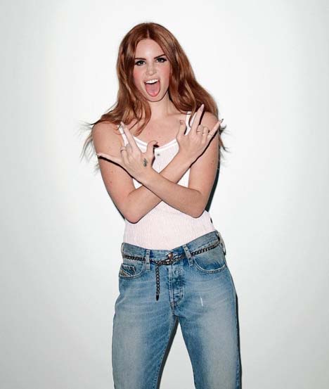
On the front cover there is a close up of my artist, with a pull quote saying ‘Quintessential English Rose’. I made my artist look as English as possible. My model already had red/ginger hair, but I wanted to make the red more prominent. I changed the tones of the hair to a slightly more red tone. I changed the contrast of the image to make her skin more pale, which then elaborates all of the attention onto her hair. Although the artist doesn’t necessarily wear ‘indie’ clothing, her genre of music is well known. However I dressed her in a emerald green peplum top to bring some more colour into the equation. This could be a slight issue as the audience may look at her and feel she doesn’t dress in a certain ‘indie’ style, the audience may not be interested in reading about them. In the double page spread I wanted to represent my artist as a down to earth normal human, instead of on artist in which fame has gotten to their heads. I used witty quotes that will make the audience laugh, but to also grow to love the artist.
On the front cover there is a close up of my artist, with a pull quote saying ‘Quintessential English Rose’. I made my artist look as English as possible. My model already had red/ginger hair, but I wanted to make the red more prominent. I changed the tones of the hair to a slightly more red tone. I changed the contrast of the image to make her skin more pale, which then elaborates all of the attention onto her hair. Although the artist doesn’t necessarily wear ‘indie’ clothing, her genre of music is well known. However I dressed her in a emerald green peplum top to bring some more colour into the equation. This could be a slight issue as the audience may look at her and feel she doesn’t dress in a certain ‘indie’ style, the audience may not be interested in reading about them. In the double page spread I wanted to represent my artist as a down to earth normal human, instead of on artist in which fame has gotten to their heads. I used witty quotes that will make the audience laugh, but to also grow to love the artist.
Friday 15 March 2013


Thursday 14 March 2013
Double Page Spread Article
In the latest video for ‘13’ indie/alternative single released by Rosa Leigh earlier this year, the innovative singer is touring rural areas around the country to spread her love for music. Her incredible husky and muted tone leaves us pining for more. Since February last year Rosa has been working exceedingly hard to get where she is today, an English phenomena. Her age is the prime time for success, therefore living her life to the max whilst she can. However fame has not gotten to her head, her hard work is paying off. Having a healthy lifestyle, shows her dedication for her fans. I got a chance to speak to Rosa, and her calm and collected ways came so natural to her. She enlightened me on her road to fame. ‘It is such a cut throat business; you can be dropped at any time’. Music is her passion for life. It is what gets her through the day. ‘Whenever I am feeling down, I pick up my guitar whatever notes my mood reflects’. This is why her music is portraying her raw emotion on stage. I asked her who her role model was during her childhood and she gave me a surprising answer; ‘You would think it would be an old school indie band such as Oasis or Pulp, but in actual fact I worshipped Beyoncé. Everything about her inspired me; she was a true R&B legend’. Even though her role models do not reflect her genre of music, instead she has found a style that suits her unique voice. Her high work ethic is unbelievable, whilst at work she can still endure her hobby. Within the media everybody questions new artists and bands on how long their music can last for. Whether or not they will be a one minute wonder, or a music sensation. Rosa commented on this statement and she feels that she will alter her music slightly to fit the types of genres that are popular for the era, but still keeping her unique twist which makes her recognisable. ‘There may be times where I release an unusual track that can relate to a wider audience and engage as many people as possible. Sat outside London’s Covent Garden Rosa looking impossibly fresh faced, she explains how the release of her debut album was a coincidence rather than an incredible plan. ‘It was accidental that ‘13’ was realised/made, I had a few ideas of the types of song choice I was going to go for, but didn’t realise until after my album ‘Beginning’ was released it was such a huge hit with the industry’ she comments more. ‘I started composing straight after the release in the stress of my busy schedule’. The accidental album took about 5 months to complete. Rosa has confirmed collaboration with Jamie XX. It is all hush hush at the moment. ‘I am really excited for this opportunity. All I can say as of yet is that the single will be released early 2014’. It’s a long time to wait but extremely worthwhile. Bring on 2014! All new artists get overwhelmed with the work load, gigs and upcoming festivals, they need time to rest. ‘If I relax I feel lonely and get paranoid’ she says. ‘I like being on my own but have to constantly be keeping my mind busy, such as playing my guitar, reading a book or going out for a run’. ‘I enjoy writing and keep notepads full of ideas for future songs and albums. I love to draw so have numerous scribbles and sketched from when I travel around’. Travelling is probably one of the highlights of the job. Meeting new people and breathing in cultures that you can really appreciate. ‘I love to travel, and spread my music worldwide but also taking in other people’s genre of music’. She says, ‘However there is nothing better to coming home after a day in the studio, and spending time with the family’. Style and aesthetics are widely judged upon. Rosa Leigh’s style is somewhat unique but very normal, which makes us feel at ease. ‘I’m not one for fake tan and heavy eye make-up as it is not my image, but the way I look reflects my music’. ‘I am a true red head’. We all envy her subtle red tones running through her tips and roots. ‘I love my hair, and before going back to my natural state I was every colour under the sun, but starting my career I couldn’t afford a mishap in the media, as I would get criticised heavily.’ She laughs. ‘In this industry there is the perception that every celebrity has to be perfect, and more and more people are getting wild surgery. I have come to terms with the fact that I am not perfect. I take care of my appearance, yes, but don’t’ let it control my life’. There are downsides alongside the job apart from the constant media attention but also family commitments ‘Family commitments are hard to attend to, such as Grandparents birthdays, mothers and father’s day. It hurts me as well of them to constantly let them down. However recently I have been putting my foot down and not let my job take over my life’. Fame doesn’t necessarily bring happiness. Gradually becoming more focused Rosa has made her way to the top of the charts, speeding past big names and pop sensations. With Reading & Leeds festival creeping up in a fast pace she will be one of the top artists on stage. ‘This will be my first festival. I am shitting it, but it is what I love doing, therefore I am going to enjoy it and make the crowd go crazy’. ‘Everyone’s high as kite at summer time.’
Here is my double page article. Before I asked questions to my artist, but I struggled to think of the right sort of question that would suit my artist. So I chose to write a full article with my artist talking, and I used quote marks to indicate that she has spoken.
Here is my double page article. Before I asked questions to my artist, but I struggled to think of the right sort of question that would suit my artist. So I chose to write a full article with my artist talking, and I used quote marks to indicate that she has spoken.
Wednesday 13 March 2013
final photostream


jessrosegreenfield's photostream on Flickr.
Here is the final photo shoot that I did, starring two more people. I plan on using these pictures on the contents page. I prefer the ones on the brick wall as they seem slightly edgy and the model here poses excellently. The lighting is bright and the main attention is on the model. I decided to dress them both in grey and muted tones as this goes with my colour palette and reflects back to my minimalistic style and approach towards my magazine. I wanted one of my models to wear red lipstick to bring some colour into the equation, along with the colours of the brick wall. I didn't want the images to be too bland on the page, therefor I chose to do it this way. After going through some poses that looked good in my head, when I tried them, they didn't look as aesthetically pleasing as I would have hoped. The camera quality was good, and they turned out better than hoped for. I am really pleased as to how professional they are.
Here is the final photo shoot that I did, starring two more people. I plan on using these pictures on the contents page. I prefer the ones on the brick wall as they seem slightly edgy and the model here poses excellently. The lighting is bright and the main attention is on the model. I decided to dress them both in grey and muted tones as this goes with my colour palette and reflects back to my minimalistic style and approach towards my magazine. I wanted one of my models to wear red lipstick to bring some colour into the equation, along with the colours of the brick wall. I didn't want the images to be too bland on the page, therefor I chose to do it this way. After going through some poses that looked good in my head, when I tried them, they didn't look as aesthetically pleasing as I would have hoped. The camera quality was good, and they turned out better than hoped for. I am really pleased as to how professional they are.
Wednesday 27 February 2013
Slight Changes

The slight changes I have made are the positioning of the barcode. Before the barcode was positioned in the border, now half of it is on the spine, then the other half will be on the back cover. I have also changed the positioning of 'The alternative magazine' to the other side, as I felt that there was too much lettering on the left hand side, therefore it needed balancing out. I also changed the wording at the bottom of the page to 'Quintessential English Rose', i felt that these words descirbed my artist Rosa Leigh best.
Second Draft Cover

Here is my second draft, as you can probably tell from my previous draft and posts it is completly different. after analysing my feedback I altered things slightly in order for the cover to look more proffessional, clean and minimalistic. I chose to use a border to seperate my image from the masthead, inspired by 'Loud and Quiet' magazine/newspaper. I have changed the font of the masthead to a font called 'Blackout Midnight' which I prefer to my other draft as it was too light and didn't really represent my magazine well. Whereas this font is bold, and could become recognisable with potential other copies of the magazine. the image is also different as i wasn't too pleased with the outcome of the other image I used, as there was writing on the top so there were limitations with tag lines. Therefore I have chosen to use this image of Ellie, as it looks proffessional. I made a few changes to the hair colour, as before it was a very light red colour but i wanted to enhance the colours slightly and make the red more vibrant. I think it looks very natural here, as it is a nice contrast towards the olive green peplum top. In the next photoshoot I will put Ellie in different types of clothing, perhaps a plain black top, that is minimalistic and simple, so the main focus and colour is her hair and lips. I have decided against taglines in this draft as I don't feel that it is necessary to use, however in my final design I might have to incorporate some catchy taglines of some of the indie/alternative singer/songwriters and bands at the current time.
Friday 22 February 2013
Feedback
Mrs Abrahamson
Cover
- Clean lines and good photo
- Very good research and planning preparation
- The cover is a bit plain
- More cover lines are needed in the left side third
- More 'Music' contents
- Bring model closer to camera (close up shot)
- Article is too short
- Needs to be double the length
- Need to look at actual articles to know what questions to ask.
Cover
- Change positioning and font of the cover lines
- Move the barcode to the left
- Great image
- 'magazine' is too long, needs to be in line with the 'N'
- Needs more than three areas ofsub headings
- Text needs work- look at real contents pages for ideas
- Too much space in some areas
- Remember its a music magazine
- Columns need to be the same width
- Good use of fonts
- Move the page number and website
- Not enough text
- Only five questions
- Read a few articles and copy the style
- More columns
- Brilliant images
Friday 8 February 2013
A rethink of my magazine


After finishing my first draft of my magazine I really need to reconsider the way I want my front cover to look. Looking back at ID magazine each cover is so unique, without having many tag lines the magazine still is sucessful. After the test shots with Ellie, I really need to be more prepared with the photography skills, the way she will be positioned and the clothing I would like her to wear. I also need to work on the types of taglines, and the typography on the cover along with the graphology of the magazine, including the colour palette and the over all layout of the magazine.
As I have said before i would like the poses to be quirky throughout the pages on my magazines to relate back to the indie/alternative genre of the magazine.
Terry Richardson


Terry Richardson is an American fashion, portrait and documentery photographer.
He has done shots for many well known campaigns; Marc Jacobs, Aldo, Supreme, Yves Saint Laurent.
However he does cause some controversy because of his 'sexual nature'. In my opinion its his style of photography and works extremely well with the models and celebrities that appear in some of his work.
I love Terry's work as the models are so relaxed, they are natural and quirky poses. The celebrities/models look like they are having fun in a controversial way. I really want to take some inspiration from him, by maybe recreating this in my final shots of my magazine.
Subscribe to:
Posts (Atom)