Wednesday 27 February 2013

Slight Changes

The slight changes I have made are the positioning of the barcode. Before the barcode was positioned in the border, now half of it is on the spine, then the other half will be on the back cover. I have also changed the positioning of 'The alternative magazine' to the other side, as I felt that there was too much lettering on the left hand side, therefore it needed balancing out. I also changed the wording at the bottom of the page to 'Quintessential English Rose', i felt that these words descirbed my artist Rosa Leigh best.

Second Draft Cover

Here is my second draft, as you can probably tell from my previous draft and posts it is completly different. after analysing my feedback I altered things slightly in order for the cover to look more proffessional, clean and minimalistic. I chose to use a border to seperate my image from the masthead, inspired by 'Loud and Quiet' magazine/newspaper. I have changed the font of the masthead to a font called 'Blackout Midnight' which I prefer to my other draft as it was too light and didn't really represent my magazine well. Whereas this font is bold, and could become recognisable with potential other copies of the magazine. the image is also different as i wasn't too pleased with the outcome of the other image I used, as there was writing on the top so there were limitations with tag lines. Therefore I have chosen to use this image of Ellie, as it looks proffessional. I made a few changes to the hair colour, as before it was a very light red colour but i wanted to enhance the colours slightly and make the red more vibrant. I think it looks very natural here, as it is a nice contrast towards the olive green peplum top. In the next photoshoot I will put Ellie in different types of clothing, perhaps a plain black top, that is minimalistic and simple, so the main focus and colour is her hair and lips. I have decided against taglines in this draft as I don't feel that it is necessary to use, however in my final design I might have to incorporate some catchy taglines of some of the indie/alternative singer/songwriters and bands at the current time.

Friday 22 February 2013

Feedback

Mrs Abrahamson
  • Clean lines and good photo
  • Very good research and planning preparation
  • The cover is a bit plain
  • More cover lines are needed in the left side third
  • More 'Music' contents
  • Bring model closer to camera (close up shot)
  • Article is too short
  • Needs to be double the length
  • Need to look at actual articles to know what questions to ask.
Mr Ford

Cover
  • Change positioning and font of the cover lines
  • Move the barcode to the left
  • Great image
  • 'magazine' is too long, needs to be in line with the 'N'
Contents
  • Needs more than three areas ofsub headings
  • Text needs work- look at real contents pages for ideas
  • Too much space in some areas
  • Remember its a music magazine
  • Columns need to be the same width
Double Page Spread
  • Good use of fonts
  • Move the page number and website
  • Not enough text
  • Only five questions
  • Read a few articles and copy the style
  • More columns
  • Brilliant images

Friday 8 February 2013

A rethink of my magazine


After finishing my first draft of my magazine I really need to reconsider the way I want my front cover to look. Looking back at ID magazine each cover is so unique, without having many tag lines the magazine still is sucessful. After the test shots with Ellie, I really need to be more prepared with the photography skills, the way she will be positioned and the clothing I would like her to wear. I also need to work on the types of taglines, and the typography on the cover along with the graphology of the magazine, including the colour palette and the over all layout of the magazine.
As I have said before i would like the poses to be quirky throughout the pages on my magazines to relate back to the indie/alternative genre of the magazine.

Terry Richardson


Terry Richardson is an American fashion, portrait and documentery photographer.
He has done shots for many well known campaigns; Marc Jacobs, Aldo, Supreme, Yves Saint Laurent.
However he does cause some controversy because of his 'sexual nature'. In my opinion its his style of photography and works extremely well with the models and celebrities that appear in some of his work.

I love Terry's work as the models are so relaxed, they are natural and quirky poses. The celebrities/models look like they are having fun in a controversial way. I really want to take some inspiration from him, by maybe recreating this in my final shots of my magazine. 

Test Shot Photostream

090089087086085084
083077076075074073
072071070067066064
063061059057049046
These shots came out quite successful. When it comes to the final magazine, I am going to take into consideration the clothing, makeup and other necessary lighting needed to make the shots even more successful. I also need to think about the types of fashion has inpired me or that will inspire me for the front cover. I prefer the shots of Ellie (Rosa Leigh) when she is in the green peplum top, as she looks more like a celebrity, whereas with some of the other shots, (the ones with the writing on the top) looks like an ordinary person off of the street. The green really compliments Ellie's skin tone and hair colour.

Thursday 7 February 2013

DIVISION MAGAZINE DRAFT

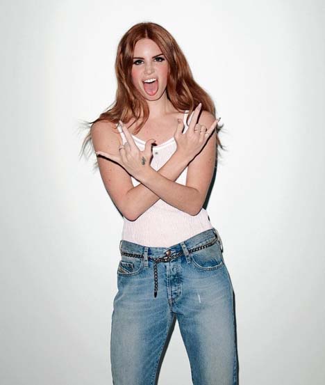
This is my final draft for the front cover of my magazine. Im not too keen of the layout and the photograph as I didn't spend much time on picking out an outfit and perfecting the photography. For my final cover page I will use different font for the tag lines on my page, as I made a mistake by using the same font as my masthead, I should have kept it separate. Next time photography wise I will ensure that the model is up to scratch with the clothes that she is wearing, and making sure that the make-up is appropriate for the type of lighting used. I will use a different lipstick, and maybe some darker eye makeup to fit in with the genre of my magazine. The colour scheme is pretty non existent. I will make sure I have a specific colour palette that will look successful. I will also choose a different positioning for the model, maybe do a quirky pose top get a wider range of audience; such as, loud and quiet magazine and wonderland magazine. However I do really like the font used as the masthead, and it has a sketchy feel and can be made to look recognizable. 


Here is the draft for my contents page. So far I am really happy with it as it looks clean and minimal, and looks really professional. The font is sketchy, with a bold subheadings. The other text is in capitals as I feel this looks aesthetically pleasing as well as being able to be read easily. I like the colour palette of black and white, this way the images that I have taken stand out more, making it the main attention on the page. In my final copy I will use different models, however for this draft I only wanted to get a rough idea as to what it looked like and to see how the layout will look like. The layout of the contents page was inspired by 'Loud and Quiet' magazine, as it is proffessional, and minimalistic.
Here is my double page spread. I am unhappy with the way that this turned out as it looks very rushed and looks like not a lot of time was taken on it. The content of the article isn't up to scratch either, as I need to provide more information to the audience, but also make it seem interesting, however as it is a draft I just wanted to get a feel for how the layout of the page will look like, without spending a lot of time over the content of the article. As of yet I am still unsure as to whether I am going to ask questions to my artist or just write an article explaining all about her work, and her past, present and future. This way I can write more, with it still being an intersting read.

Style Post


Here I have styled an outfit together that I feel will look good on my model and for the cover of my magazine. I want the outfits to be on trend/stylish, but comfortable and laid back. However I don't want it to turn out scruffy, my model has to look different, but like a celebrity and appealing for my audience. The tones I have gone for a within a certain colour palette of red, white, grey, black, and gold. Black will be the main colour in some of the outfits, as it links in with the colour of the masthead on the front cover of my magazine. 

Artist's Profile- Rosa Leigh


NAME: Rosa Leigh

AGE: 18

MUSIC STYLE: Acoustic, chilled, good beat

HOBBIES/INTERESTS: playing guitar, singing, listening to music

DISLIKES: pop music (justin bieber)

FAVOURITE COLOUR: blue, green, black
                         

COVER: Messy hair, red lipstick, black and white clothing/ colourful, close up, mid shot.
               Mirror shots to reflect 'Division'


Saturday 2 February 2013

Analysis Of Institution-Bauer Media Group


Bauer Verlagsgruppe logo2.svgBauer Media Group is a multinational media company, held in Germany, which operates in 15 countries worldwide. The company was founded in 1875, and since then has been privately owned by the Bauer family. The group is extremely successful and titles amounts of 38 million magazines a week, such as; Q Magazine and Kerrang.  The group has been managed by four generations, starting off as a small printing house, the publishing group has grown into a well known worldwide business, with not only magazines, but with TV and Radio Stations, it is now known as Britain’s 3rd largest publisher. As this institution is so well known in the music magazine business, I feel that this is appropriate for my magazine, as it will have good publicity. They would publish my magazine, as it has a wide target audience of teenagers to early/late twenties.  The overall look will be indie/alternative the genre is well known in the music and fashion industry for magazines, therefore Bauer company, will be part of a successful and appropriate magazine. 

Friday 1 February 2013

Audience Profile


NAME: Lydia Rosewood

AGE: 21

LOCATION: London

HOBBIES: Blogging, photography, music, plays guitar, drawing and trend spotter

FAVOURITE BANDS: The XX, The Vaccines, Jake Bugg, Arctic Monkey's, The Rolling Stones, Lana Del Ray, Bombay Bicycle Club.

FAVOURITE COLOURS: Black, Purple, Bottle Green, Yellow, Pastel Colours, Neutrals.

INSPIRATIONS: Fashion blogs, magazines, people, friends/family, travelling.

Double Page Spread Analysis


This magazine double page spread is extremely unique, as many different fonts and sizing has been used in terms of graphology. The large ‘S’ takes up most of the page on the right side, making it the central, and the first thing that is looked at on the page. The colour palette is again neutral, with the use of Lana Del Ray on the left the main source of colour by using, deep purples, a flash of red on her hair, and then a blurred finish to the image. Her iconic nails are always shown in her modelling, as it is recognised by her ‘fans’. She is extremely stylish and fits in with the style of the magazine, (Q Magazine) well. However the amount of text that is written hasn’t got a vast amount of detail. Therefore for my double page spread I would like to write an adequate amount of text, asking all of the correct questions that will entice my audience/readers, asking questions that everybody wants to know, but are unusual and quirky to relate back to the genre of the magazine.
This double page spread is rather sophisticated with the font use, size and the colour palette used. The ‘L’ in the centre of the page finishes off the palette of red, white and black. The L links with the singer ‘Lady Gaga’ but also the theme of ‘Q Magazine’, it reflects back to the genre of magazine, giving it their own take. The picture on the left is quite provocative to some readers, but can be enticing for female and male readers, because of the way Lady Gaga is positioned. Overall I really like this spread, as it has a professional vibe and is enticing to read, however I feel that the large ‘L’ in the middle is off putting, and could make it hard to read for the audience.
Again this magazine spread is professional and sophisticated, this time the image is less poised, and it is more relaxed, of the band in action at a gig/festival. This entices readers who possible went to the gig and want to read about what is said, and possible relate back to it, and almost relive the experience. The colour palette is mixed up slightly, and is not very specific. The colours are; blue, black, red, and white. These colours suit the genre well. However I feel that the colour of the background on the right shouldn’t be a harsh white, but maybe a more neutral light brown (sepia) this gives it a higher end appeal, as at the moment I feel the magazine looks tacky and lacks a few qualities. In my opinion the colour palette is everything and is a key technique that needs to be done in the correct way in order for the magazine sales to be successful.

LOUD AND QUIET


LOUD AND QUIET magazine is a free monthly magazine/paper that 'features new indie, alternative, electronic, and rock bands. Its style is known for being 'clean and minimal'. I love the style of the magazine as it is a different size to any other magazines, which makes it unique and successful. The clear typography has incredible potential, and is really bold, which makes the magazine recognizable. Inside the magazine the double page spreads are inspirational. The contents page is also simple, which relates back to the genre of the magazine. I will definitely be taking some inspiration from this magazine as the minimalistic look is something that I love in a magazine, making it an easy and enjoyable read.