Target Audience: LEADING EDGE
My audience type are known for being 'the smallest segment in the youth market', they are 'fairly grown up' and are 'hugely influential within specific genres of music and fashion. 'These tribes stand at the gateway of popular culture', they have an enthusiasm for recycling, and art that makes them recognisiable (indie).
Having looked at UK Tribes it has really helped me decide the type of audience that I would go for, however I feel that some of the views portrayed on the site is extremely stereotypical. Therfore I am going to do my own research on my target audience, in order to engage a wider audience, to build up my views.
I still would like the genre to be indie, and would like the viewers to be into style, and are on trend, people with a wide range of musiacl tastes, but prefereably of an 'indie/alternative' style.
Thursday 31 January 2013
Possible Fonts
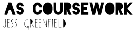
I chose the name 'DIVISION' as it is inspired by 'Joy Division', but can also have different meanings. Such as a division in the music industry between old and new. I feel that DIVISION works well and by testing out some of the possible fonts below I can really have a feel as to what my magazine masthead will look like.

These are some of the fonts that I feel are appropriate for my final magazines. I love the top ones as they are bold, and are perfect for my title page. I feel that the 4th one is perfect for the font on the contents page and other necessary writing on the double page spread. I would like to keep the fonts very consistant throughout the magazine, to keep the the theme of indie/alternative. the second one i love, however I feel that it is really hard to read, and this could be a problem for the front cover. It could be recognisable for the irregular style of the font. All of the fonts I have chosen as I think the fonts will attract a certain type of audience. I might decide to change my fonts as I am making the magazine, in photoshop, for example, a certain font may look wrong or not aesthetically pleasing compared some of the others that I have chosen.
Tuesday 29 January 2013
Monday 28 January 2013
Contents Page Analysis

This contents page uses a neutral colour palette of black, grey, tope, and mink. Even the model lying down is wearing neutral clothing and almost blends into the gradient background, however, her legs play a huge part on the page, as it draws our attention towards the title as we follow the model from her eyes all the way to her feet. The graphology is very unique and is set out in a very aesthetically pleasing way, as it is separated out into different layers. This style is extremely consistent throughout the magazine company, so make the magazine memorable just like a front cover page. Another graphology technique that I have analysed is the italic, glamorous font that is used as the subheadings for the contents page. The typography relates back to the style of magazine and genre. The outline of the ‘V’ in the background mimics the models legs, the model is in an abnormal position, as usually models look comfortable and are in a relaxed position. This makes the magazine different and perhaps the magazine wants to portray a different message for the specific audience.


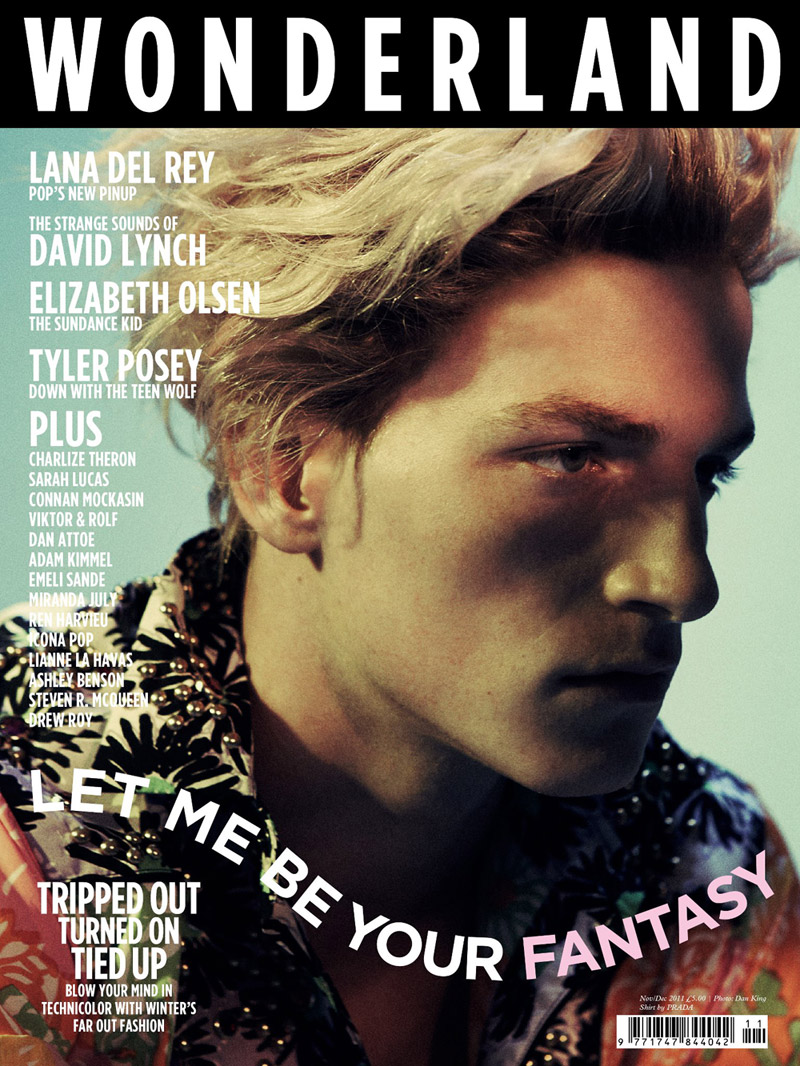
This contents cover is extremely different to the others that I have analysed, as it is on a double page spread. The focal image is of a male and female model, fitting in with the indie vibe that the magazine portrays. The graphology is similar to another magazine that I analysed, as the style of ‘cutting out’, It looks extremely effective and I am considering including this effect within my final magazine. The main colour palette that has been used are; red, black, white, yellow and other neutral tones. The font is very creative and arty as well, which looks like a label maker machine. In my previous posts in my blog I have used the label font, as I really like the style and the effect it has on making a page look. I used this font on my ‘X Magazine’ cover, stating ‘Lana Del Ray’.

Sunday 27 January 2013

Photography Rumi Neely
Rumi Neely is both a fashion model and designer who has dabbled in photography.
I love he style of photography, her backgrounds and scenery are so beautiful and are really inspiring.
Magazine Cover Research

This is one of my favourite covers that Company magazine have done, starring Alexa Chung. The masthead colour is bold and stands out above the other neutral colours used within the rest of the colour palette; the sizing is a perfect fit for the sizing of the magazine. The type of colour palette used has inspired me to create a magazine in this style, the neutral colours are great for a background which means brighter text and images can be placed over the neutral background. Alexa is covering the title as the magazine is well known to fashion readers. The fact that the magazine’s masthead is at the top is so when on a shelf, it is easily identifiable for the readers. The pricing is extremely prominent to readers as it is advertising a good offer of ‘£2’. The models that usually appear on the cover of this magazine are fashionable, young and original, reflecting on the magazines content. I love the font on the cover of this magazine as it is scruffy, and looks handwritten and I love the quirky style that is being represented. Quite a lot of text is written on the cover, such as, ‘The New Denim!’, ‘High-Street Edited’, although the cover line is short, it suggests what sort of content is in the magazine. The barcode is placed in an odd place as usual, but the barcode consists of the date, and the website. For a cheap magazine this is a successful cover, which has been made professional looking, and suitable for the target audience of 16-27 year olds. The position of Alexa looks really comfortable and chilled, which is the vibe I would like to achieve within my music magazine.

Dazed
magazine is ‘The magazine with the long established reputation of having the
best fashion, photography and art content in the entire world, Dazed
& Confused also includes equally high-quality pieces on film
editorial and music, and is one of the best magazines for any lover of culture’.
The colour scheme is neutral but the clothes on Beyonce set the brighter
scheme, making her the central mid shot of the magazine, implying that she will
take part in some way within the magazine. The magazine masthead is covered
quite a lot with Beyonce’s head, but as the magazine is well known around the
world it becomes recognisable. The name of the magazine is really inspiring
with a quirky vibe. Although, there is not much text on the cover, but as it a
subscription magazine, collectors don’t really want writing covering the issues,
there also appears to be no barcode on the cover which is also suitable for
collectors ‘Beyonce pop vs life’ is a really enticing cover line, perhaps for
an age range of 18-27 year olds. However this issue looks mature, than some of
the other covers that Dazed has come out with. This implies that the magazine
is targeting for a wider range of readers, suiting everybody’s needs.

Usually NME magazine masthead is red due to the
colour scheme of black, red and white. These colours have still been used but
the colour of Florence Welch’s (cover star) hair and the cover line incorporates
the colour of red. Florence is behind the masthead in this issue, in some other
examples of issues, most of the cover stars are layered over the top of the
masthead, the font and sizing of NME is consistent throughout the issues.
Underneath the masthead are the issue number and the pricing of the magazine,
this is important information, so needs to be shown in an easy area, as the
pricing and date is what is looked at
most in a magazine. The graphology used is extremely eye catching and attracts
the reader’s attention. I love the fact that the word ‘Florence’ is the biggest
font and boldest colour on the cover, as it is central and aesthetically pleasing.
The idea of having something ‘free’ makes the readers want to buy the magazine
even more as they feel as though they are getting things extra incorporated
within the magazine, ‘free iconic joy division posters’, the word ‘posters’ implies
that there is more than one poster. The barcode is placed at the bottom left
hand corner, kept out of the way from the creative cover. I like the fact that
it is discreet and not too ‘in your face’.
The magazine is classed as an ‘indie’ magazine, therefore has relevant
singers and bands on the front cover such as Florence Welch. Her style and
music really fits into the magazines genre.
Possible Colour Palettes

The colour palettes that I initially want to go for is very
toned down neutral colours for backgrounds, in my preliminary magazine, I used
a neutral colour palette as I feel that is clean, fresh and simple, which made
the magazine extremely professional and sophisticated, and very aesthetically
pleasing for the audience. However after doing detailed research I want to use
bold colours such as neon, (yellow, green and pink) as this appeals to an
audience of a teenage market but by having some neutral colours added in, there
is a balanced tone. I could also go into detail on certain colour palettes for
different seasons.

Friday 25 January 2013


Hexagon Magazine Preliminary


Here is my preliminary magazine for a school; I chose the
name hexagon as it is associated with schooling and mathematics. I wanted to
make the magazine cover and contents quirky, clean, and professional looking,
as I feel this look sells with the audience type of sixth form students.
I went with a neutral colour palette as it is easy on the eye, making Meg
(model) and the masthead more prominent.
Thursday 24 January 2013
X Magazine Step By Step


I made the X transparent so you could still see the figure of Lana Del Ray. If the magazine were to be a monthly issue, the colour of the masthead would vary, due to whom is on the cover.

Tuesday 22 January 2013
Hexagon Magazine- Lay plan


Here is the laypan for my preliminary lay plan of hexagon magazine. I chose the name 'Hexagon', as it goes with the idea of schools and education, in this case it is inspired by mathematics. I wanted to incorporate the hexagon shape, therefore I replaced any 'O' lettering with a hexagon.
The current layplan may change when I make my final magazine on photoshop, but I wish to follow this plan as I feel it is an appropriate design for a school magazine.
Subscribe to:
Posts (Atom)